
I’m playing with ways of emulating early orthochromatic film, if anyone knows any technical aspects to this that might help – feel free to suggest ideas. So far I’m just winging it.
Light Response of Film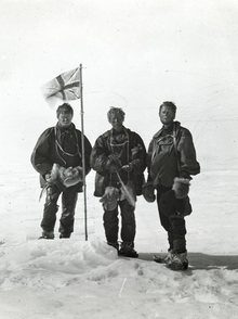
In terms of light covered it goes: Blue-sensitive, orthochromatic, isochromatic, panchromatic (all visible wavelengths) then super-panchromatic.
On the right is a photo of British explorers taken with orthocromatic film. Note the red on the flag is much darker than the blue area because the film isn’t receptive of red light. Looking at the spectral sensitivity (here) and (here) it’s clear the violet/blue area is the predominant band with it extending to green/yellow as well.
 Test Ideas
I took an image from Google, something with the British flag, and made different Channel Maps for it. The greyscaled versions are the output images.
I used the QSE tool on WavelengthPro to make a 400nm image (the violet/blue peak) and a 580nm (the green/yellow peak) and made a 2to3 map of the peaks, the colour response worked well but the data-loss from interpolation was too much. Using the original [R,G,B] channes means I won’t lose any detail, so I tried using mainly those and came up with two maps that were pretty good – GBB and GBBV. Below are those maps and the RGB map for comparison.
 |
 |
 |
| This is the RGB (panchromatic) version, the red cross on the flag is lighter than the blue parts and the sky is dark. | This is a GBBtoRGB version, the cross appears darker. It’s not really true to the actual spectral response of the film. | This is a GBBVtoRGB version, the V is the interpolated deep violet image. Getting there… |


